
Project Description
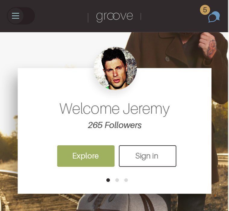
The World Should Be This Responsive
During access the internet more people are using their smart phones to research their interests, and then returning to look further on mobile devices, tablets, laptops or desktops. Your website has to fit and work on multiple screen sizes. Responsively designed sites present the whole website, with the same general-purpose content and organization you could access from a desktop or mobile device.


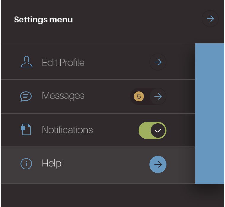

Mobile Responsive Menu
As the screen size reduces, the website will automatically switch over to a mobile friendly menu navigation.
Social Connectivity
Making sure that all your post, pages and content are share-worthy and likeable. I’ll tweet to that!
Mobile Friendly Buttons
No more incorrect selections, give users bold and easy to select buttons and call to actions. That deserves a thumbs up.
Mobile Directions
Give your web viewers an easy route to finding you, give them Google Maps to beat a path to your door.
Design Should Be User Friendly

And It Should Be …
Simply Beautiful
Intuitive User Interface
Creating an intuitive interface is often our number one goal. Everyone wants it. Websites are typically part of sales journey, for better success they should lead the viewer along a path to make decision either to get in touch or simply to buy. The steps have to be clear and intuitive. Contact our offices today and we will take the time to explain to you how we incorporate intuitiveness into our design for your benefit.

Excellent Results
We support customers throughout the app life cycle. The simpler the journey and clearer the message should lead to conversions. We will always connect you up with Google Tools so that you can analyses your website traffic as often as you like and we can be there to help you make the decisions to steer your business to success. Contact us today to get your mobile app development process started.